GPC Conference
Building a flagship conference identity
designed for longevity, recognition, and scale.
Following the organization’s transition from EMPEA to the Global Private Capital Association (GPCA), I was entrusted early in my tenure with developing the brand identity for its newly renamed flagship event. The objective was to create a visual system that aligned with the parent brand while establishing the conference as a distinct and globally credible property.
The resulting identity unified marketing, digital, and environmental experiences — positioning the conference for long-term growth while reinforcing GPCA’s presence within the global investment ecosystem.
ROLE
Brand Strategy
Identity Design
Marketing Creative Direction
SCOPE
Multi-channel campaign
Digital and print collateral
Environmental design
AUDIENCE
Institutional investors
High-net-worth individuals
Senior global finance leaders
A rebrand presents a rare moment to redefine perception.
As GPCA introduced its new organizational identity, the conference required a visual foundation that could signal evolution without disconnecting from existing brand equity.
The challenge was not simply aesthetic — it was strategic: design a system capable of supporting a high-visibility marketing campaign and premium in-person experience while meeting the expectations of a sophisticated financial audience.
Success meant balancing continuity and change, creating an identity that felt both established and forward-looking from day one.
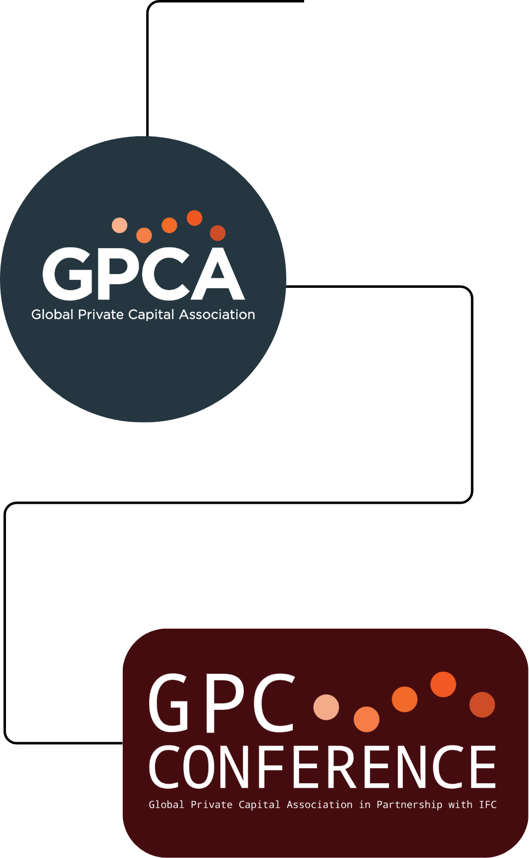
The solution drew from the GPCA core logo, repurposing its five-circle motif to create a clear visual lineage between organization and event. This approach strengthened brand recall while introducing a flexible graphic language capable of extending across channels and formats.
From the outset, the system was designed for durability — structured to support annual iterations without requiring reinvention.
Strategic Approach
I partnered closely with executive leadership to develop an identity that reinforced immediate brand recognition while allowing the conference to operate as a standalone brand.
KEY PRIORITIES INCLUDED
Ensuring cross-channel performance across web, email, social, print, and environmental applications
Designing for content-heavy programming through strong typographic hierarchy
Signaling authority and global relevance to a senior investor audience
Building a modular framework internal teams could deploy consistently
The result was a brand built not only for launch, but for sustained institutional use.
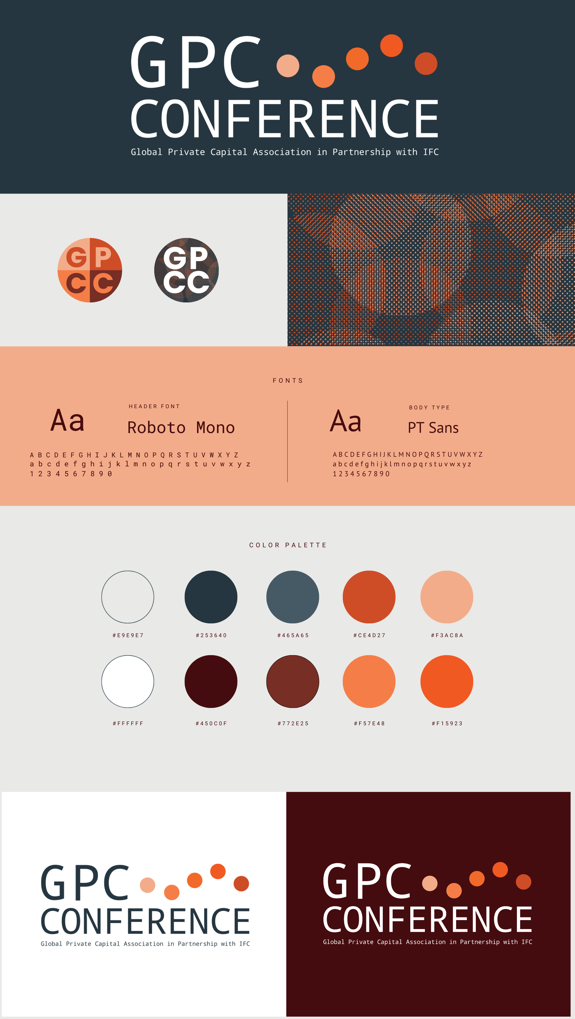
Visual Identity
The visual language emphasized clarity, structure, and institutional polish — qualities essential for communicating credibility within the investment space.
Anchored by the circular graphic architecture, the system introduced a modern yet disciplined design vocabulary that translated seamlessly from digital touchpoints to large-scale physical environments.
CORE COMPONENTS INCLUDED:
Conference logo and scalable visual architecture
Investment-grade color palette
Editorial typographic hierarchy
Modular layout system for marketing and program materials
Graphic devices derived from the parent brand
This foundation enabled a cohesive brand presence across a complex campaign ecosystem while empowering internal stakeholders to execute with confidence.
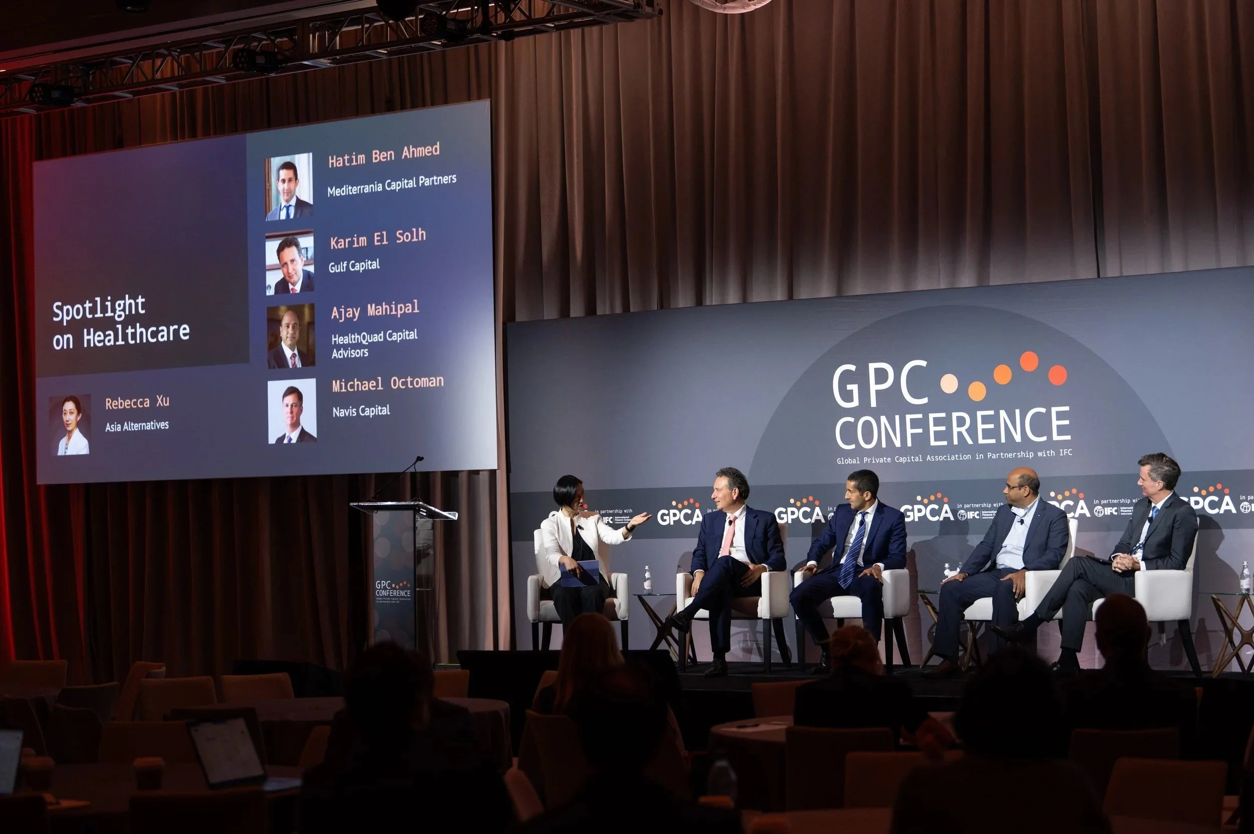
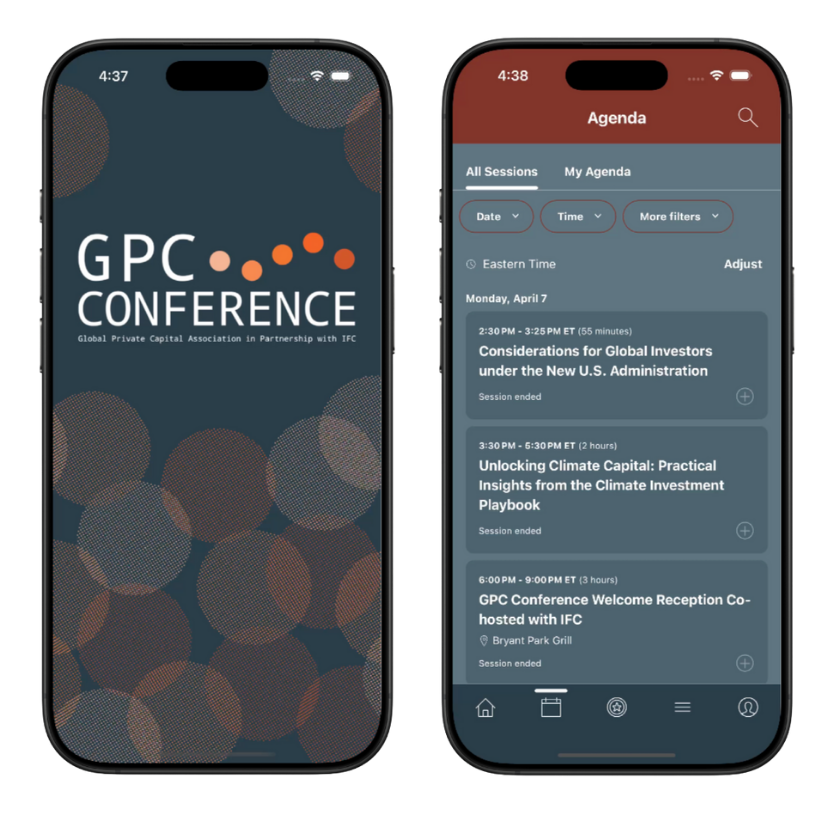
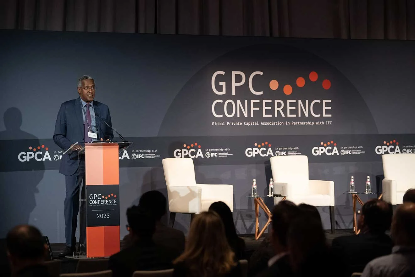
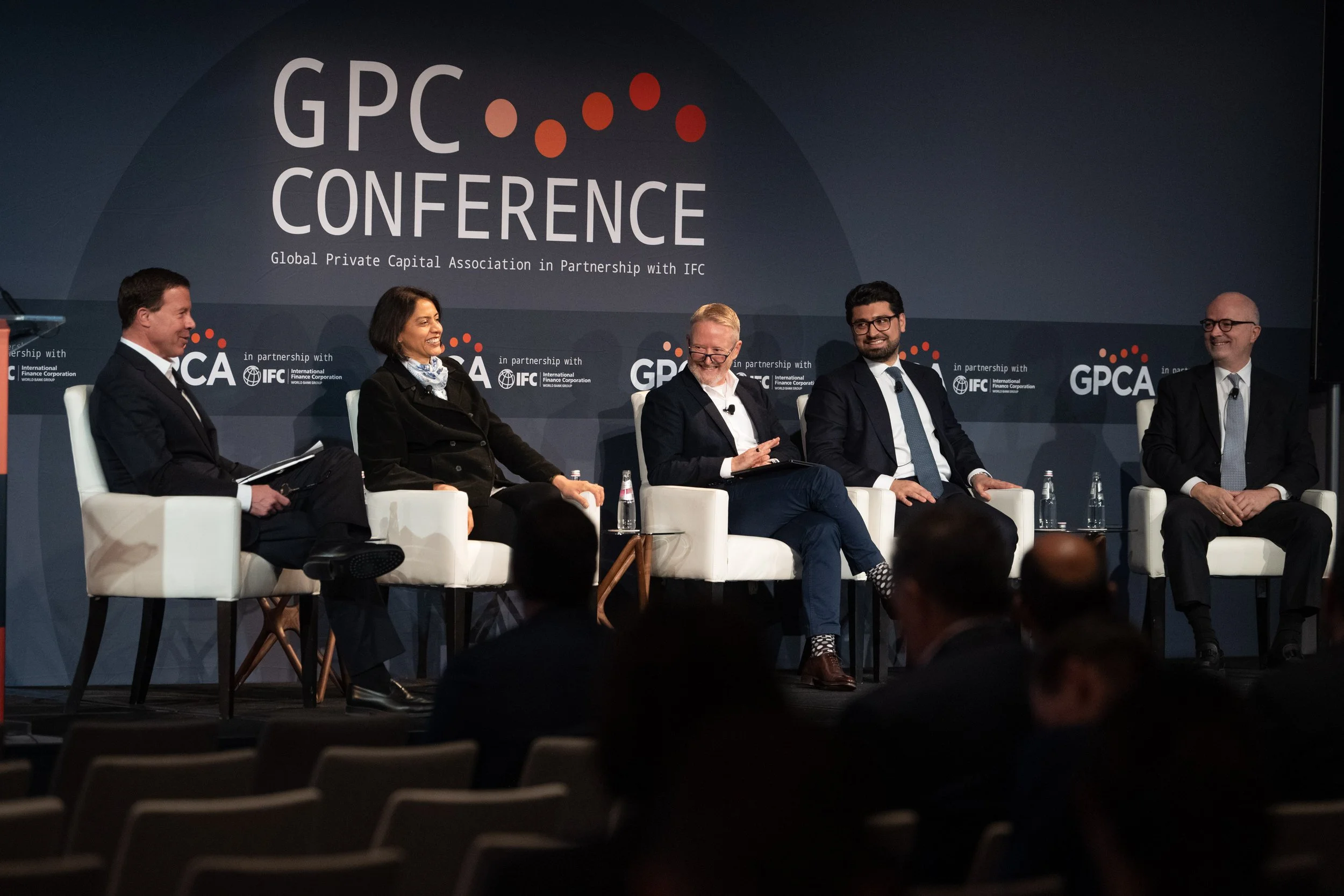
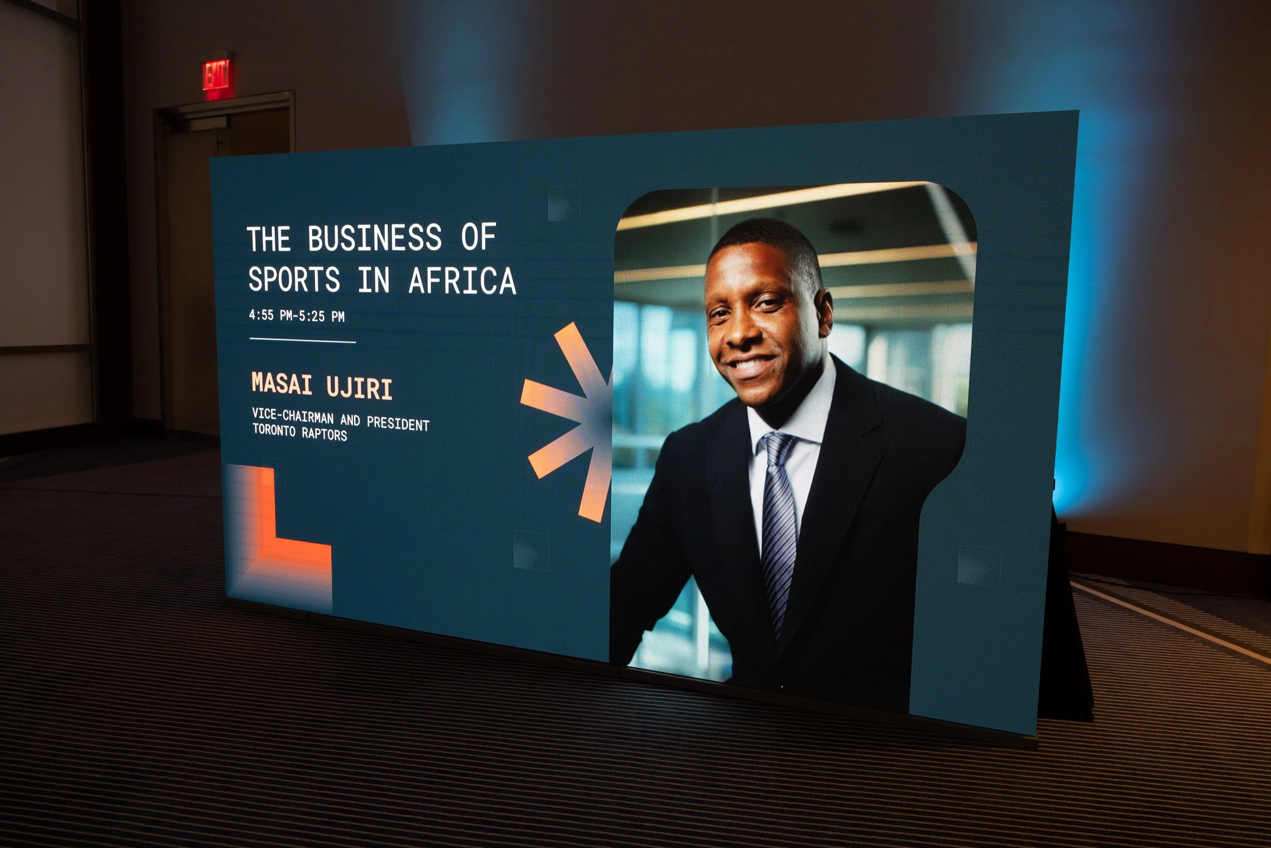
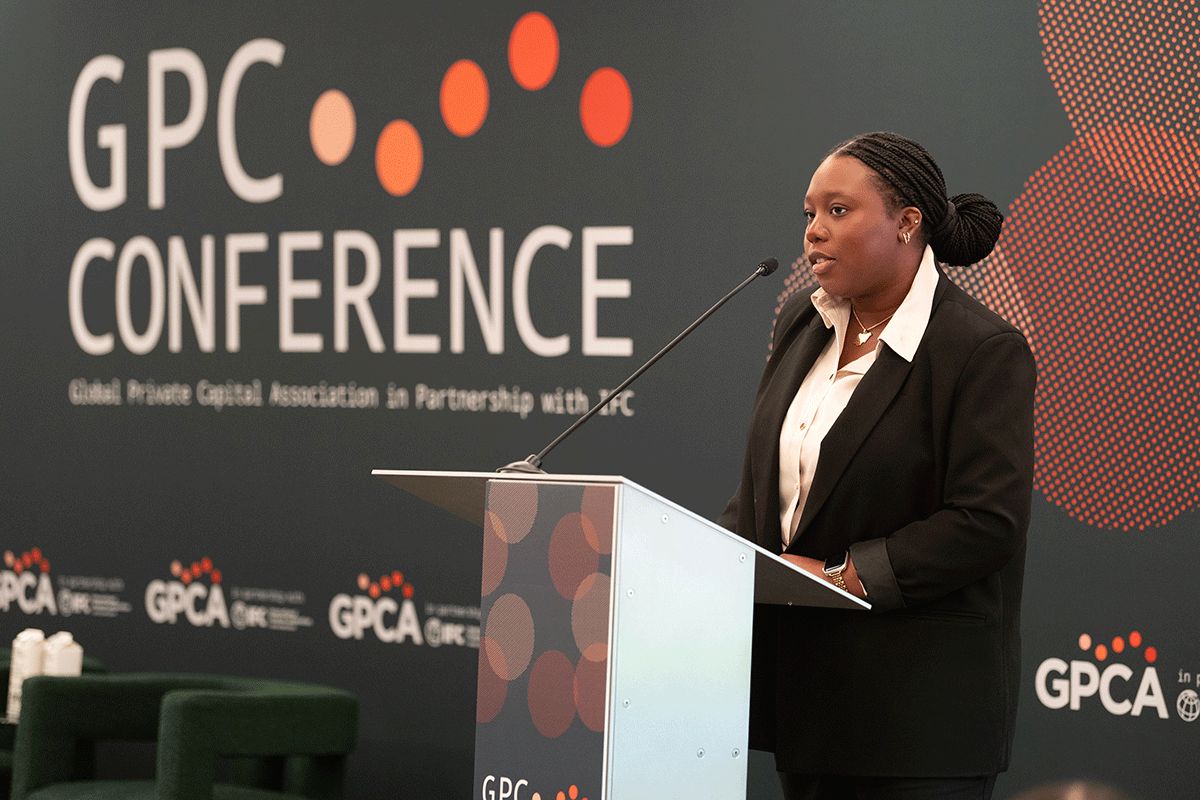
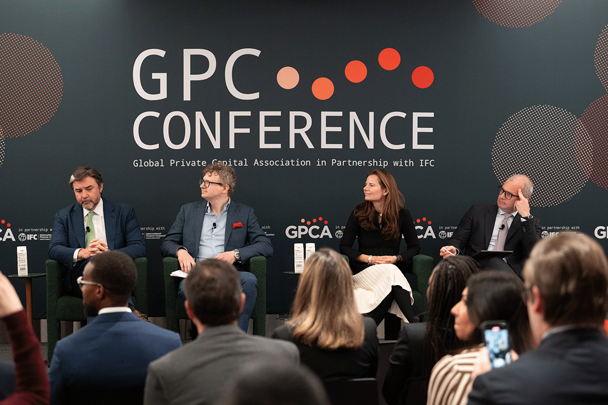
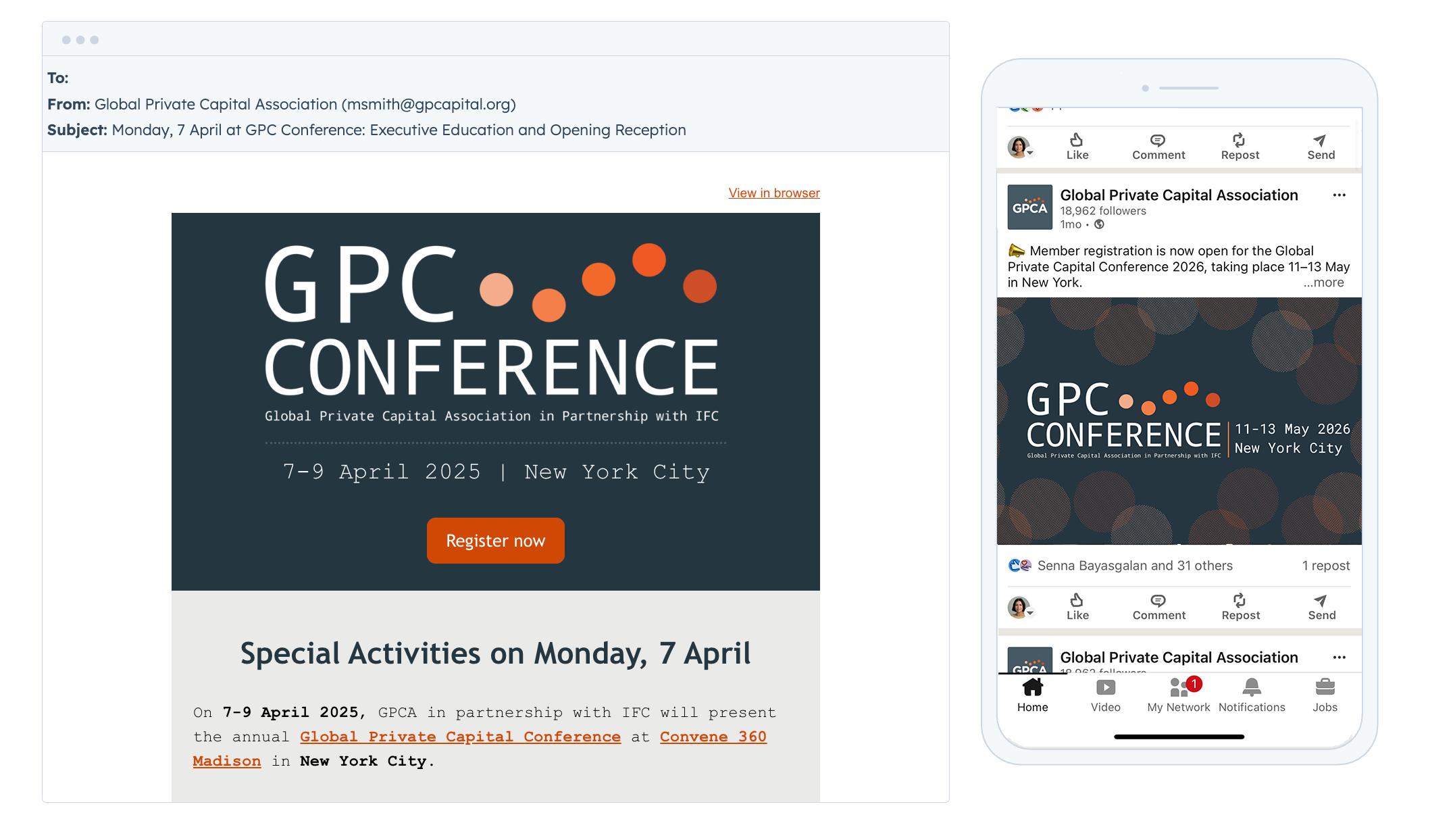
Brand in Action
The identity was deployed across the full attendee journey — from first impression through the on-site experience — ensuring continuity at every touchpoint.
APPLICATIONS INCLUDED:
Conference website
Integrated email campaign
Social media toolkit
Conference mobile app
Environmental signage and wayfinding
Stage design and large-format graphics
Name badges and attendee materials


The identity established an immediately recognizable visual foundation for GPCA’s flagship event and continues to support the conference as it evolves.
Evolution & Forward Vision
Originally optimized for horizontal applications, the identity has demonstrated durability across multiple conference cycles — a testament to the strength of its strategic foundation and its resonance with executive stakeholders.
As the event continues to expand, future refinements could further enhance compositional flexibility, particularly within square and social-first environments, ensuring the brand remains responsive to an increasingly digital marketing landscape.
This perspective reflects my broader approach to brand building: creating systems that are strategically grounded, operationally scalable, and designed to evolve alongside the organizations they support.