LAVCA
Website Redesign
LAVCA is the leading membership association for private capital investors in Latin America. As the Design Lead for their digital transformation, I overhauled a fragmented legacy ecosystem into a scalable, web-first platform. By architecting the organization’s first formal brand system and a modular information architecture, I modernized the investor experience and established a cohesive visual language that seamlessly bridges digital and physical touchpoints.
The Problem
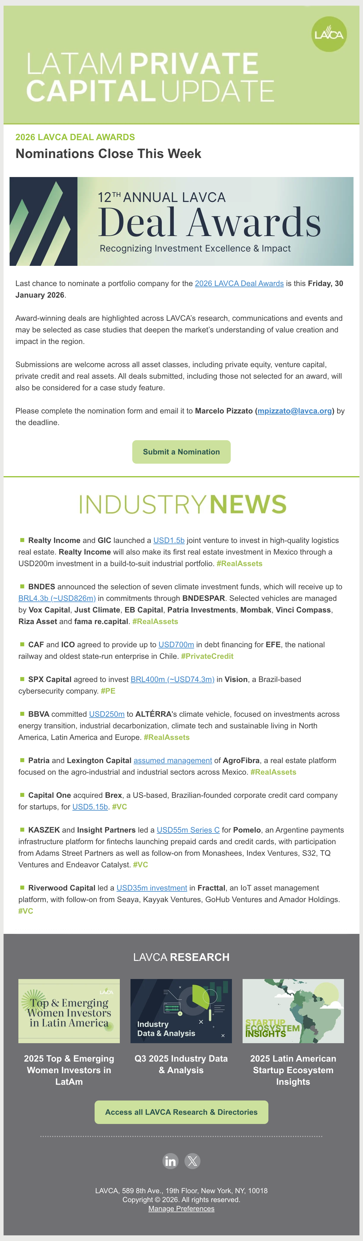
The organization’s website served as the primary touchpoint for its investor community, but years of incremental updates had resulted in a fragmented, outdated experience. Built on a patchwork of plugins and legacy solutions, the site suffered from slow performance, poor usability, and an information architecture that made it difficult for users to find relevant content. Internally, a lack of design standards created friction for content management and campaign scaling. The redesign aimed to establish a clear value proposition through a unified, high-performance design system.
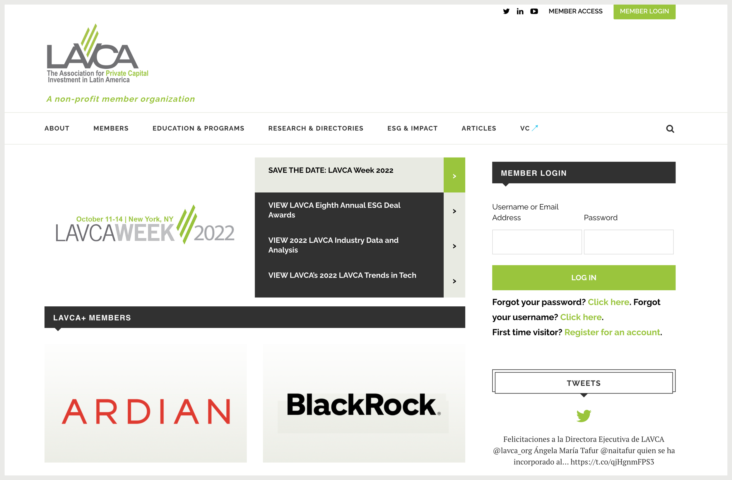
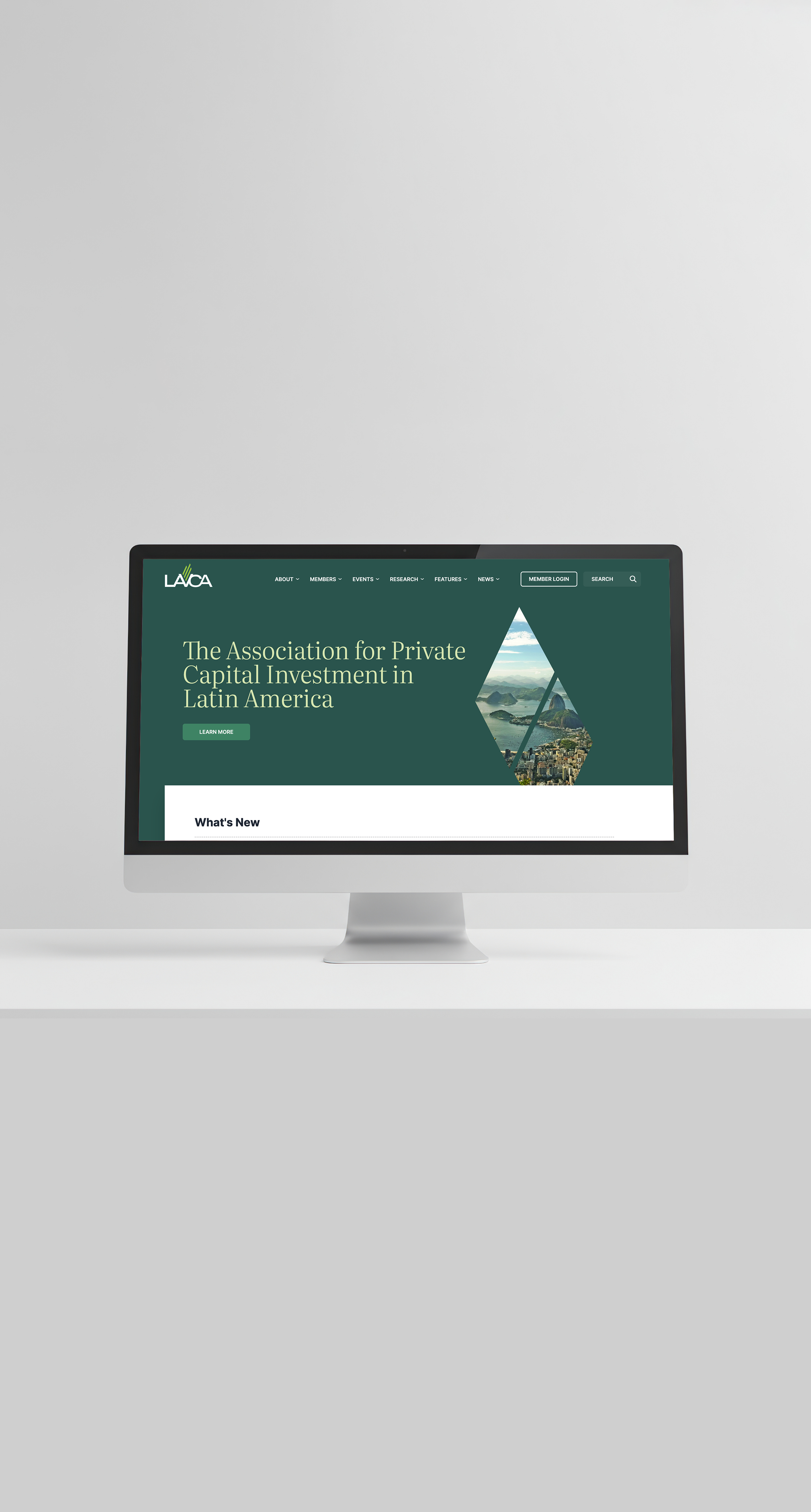
BEFORE
AFTER
My Role
I served as the primary creative director and final decision-maker for the brand system and website architecture.
1
Internal Design Lead
While the organization’s logo remained unchanged, there was no existing brand system in place. I led the development of the first formal brand guide—defining color palettes, typography, layout principles
2
Brand Architect
Managed day-to-day communication and deliverables for an external team of designers and engineers.
3
Agency Lead
I provided hands-on creative direction, developed and refined key design decisions, reviewed and guided agency deliverables, and collaborated closely with internal stakeholders and engineers to ensure the final product met both brand and functional goals.
4
Quality Owner
The organization’s visual identity needed to evolve beyond a logo-only presence into a cohesive system that reflected both its role in the finance ecosystem and the strength of its member community.

Brand Strategy
Continuity with Purpose
We preserved the recognizable lime green as a "north star," building a contemporary system around an established community anchor.
1
Elevated, Not Corporate
The goal was to elevate the brand—creating a modern, clean, and confident look that felt at home in the finance world while still expressing warmth and connection.
2
Curated Access
Used generous whitespace and intentional hierarchy to balance a welcoming community feel with the exclusivity of a trade organization.
3
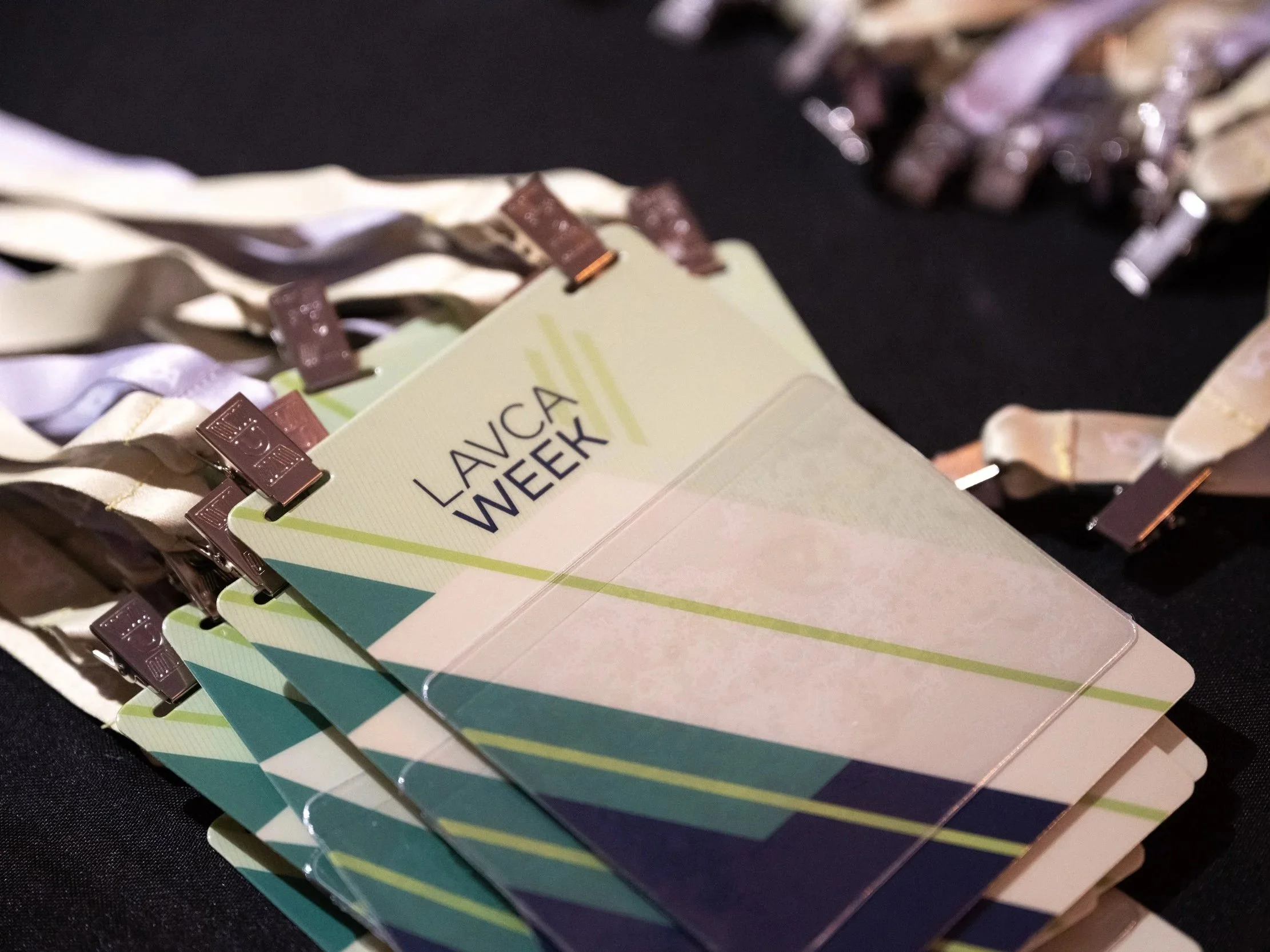
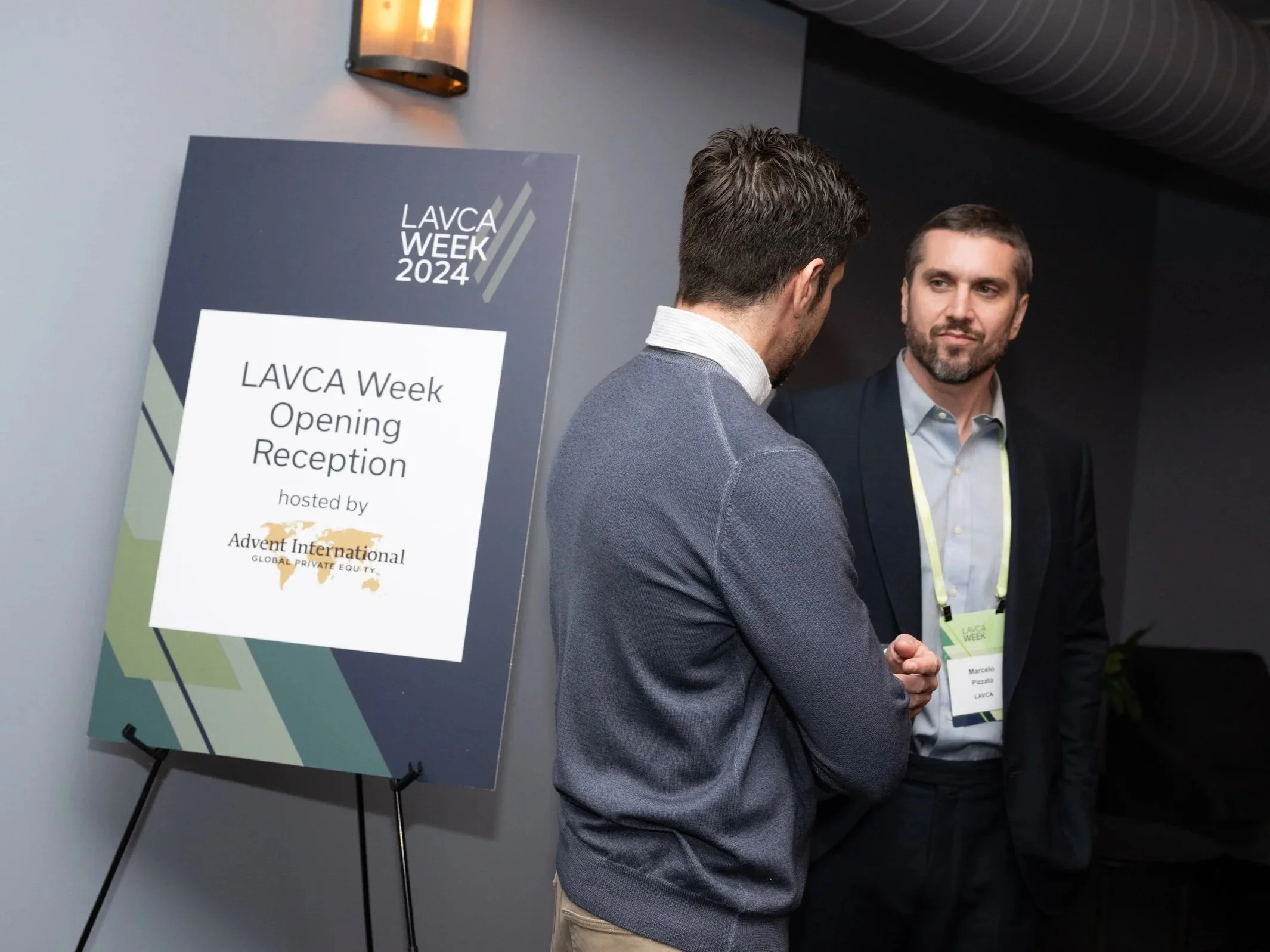
Omnichannel Versatility
Darker, richer tones of forest green and navy were intentionally introduced to replace flat grays, ensuring high-contrast legibility in both digital and live event settings.
4
Modular Foundations
Built a lightweight system focused on scalability, allowing the brand to grow without unnecessary ornamentation or complexity.
5
Key Design Decisions
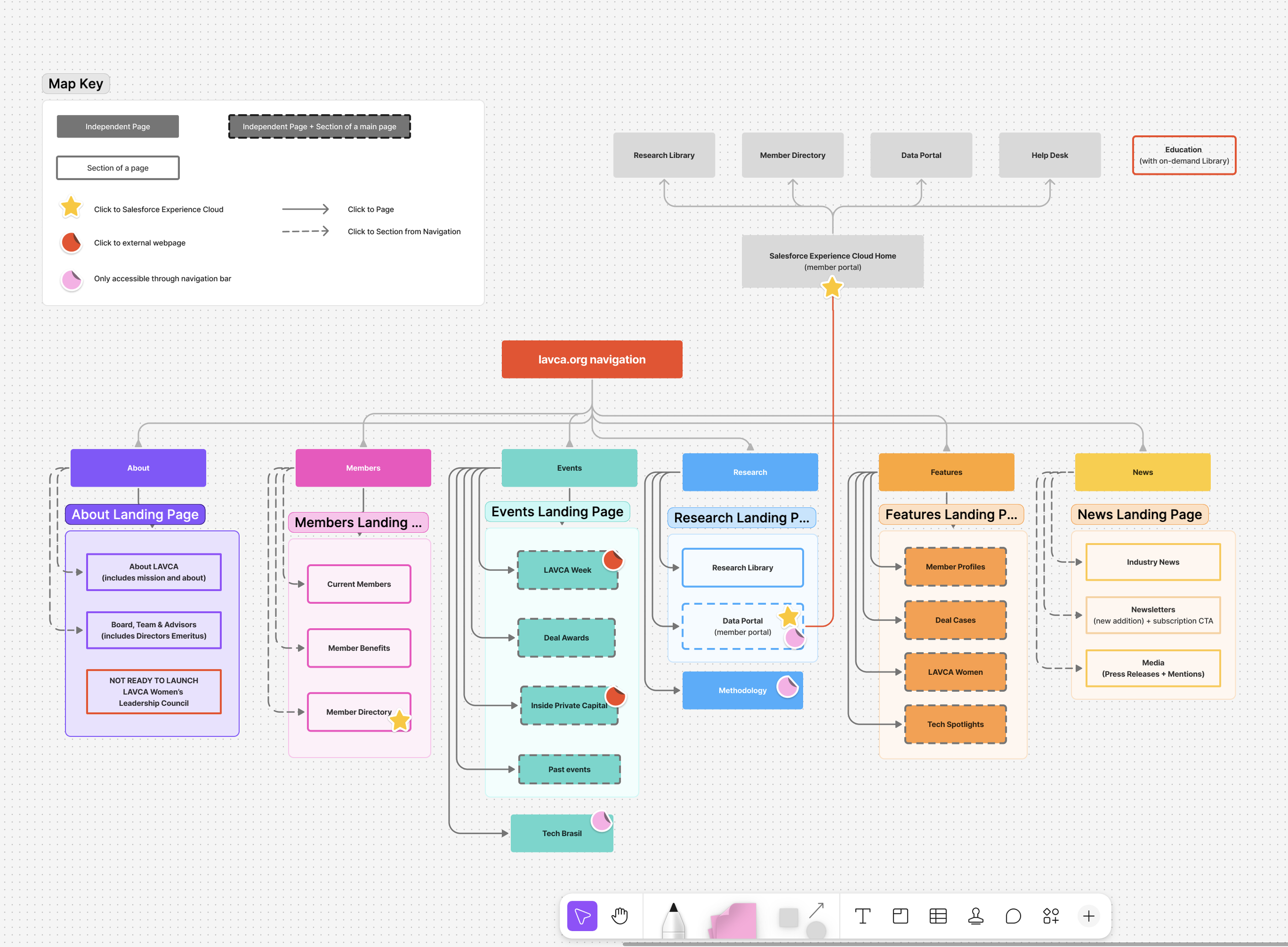
The redesign prioritized clarity, performance, and ease of navigation for both external users and internal teams. Years of accumulated content and ad hoc additions had created friction across the site, making it difficult for users to find relevant information and for staff to manage and publish content efficiently.
-
Reworked the site structure into five core categories—Members, Research, Events, News, and Features—to align with user intent rather than internal workflows.
-
Designed the homepage as an orientation tool that mirrors the primary navigation, ensuring immediate access to the organization's core pillars.
-
Strategically placed the member community high on the page, utilizing visual cues to reflect exclusivity and tiered value for premium members.
-
Developed standardized templates and content patterns to reduce cognitive load for users and simplify publishing for internal teams.
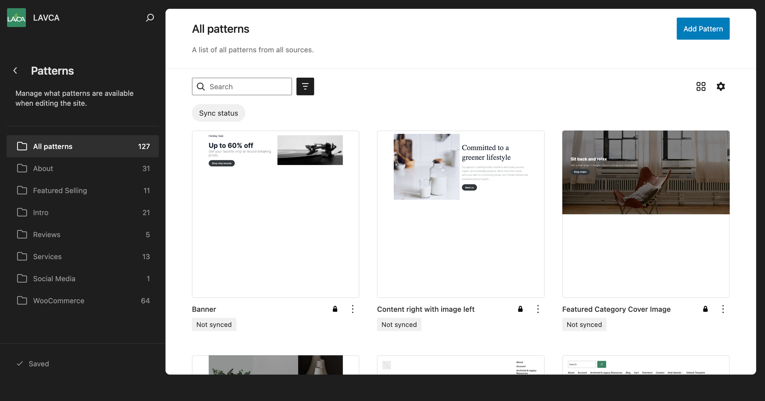
Visual System & Scalability
The redesign shifted the organization away from bespoke, one-off page designs toward a modular component library. By defining repeatable patterns for navigation, CTAs, and content cards, the system allows internal teams to launch new campaigns independently while maintaining brand integrity. This foundational layer is designed to be lightweight, supporting future growth without requiring a core experience overhaul.
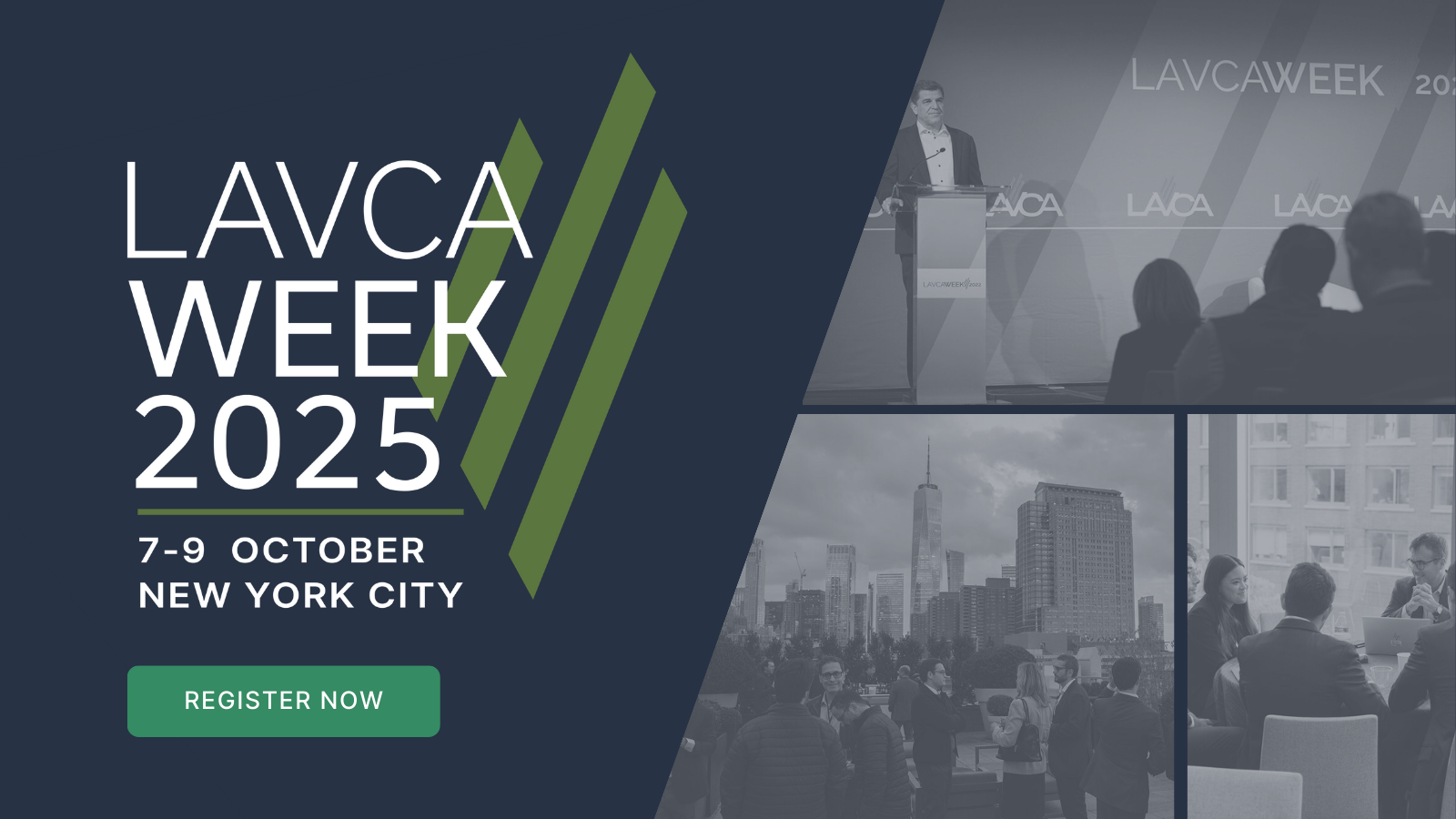
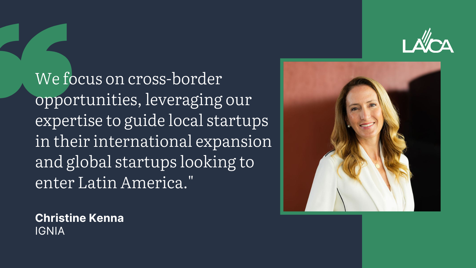
While rooted in a web-first system, the visual language was designed to extend seamlessly into key marketing channels.
Omnichannel Extensions
Email Templates
Adapted the web system into flexible layouts for newsletters, research and event promotions, optimizing hierarchy and CTA styling for mobile scanning.
Social Media Visuals
Translated the visual language into high-impact social templates, using modular layouts to keep research and member highlights consistent across feeds.
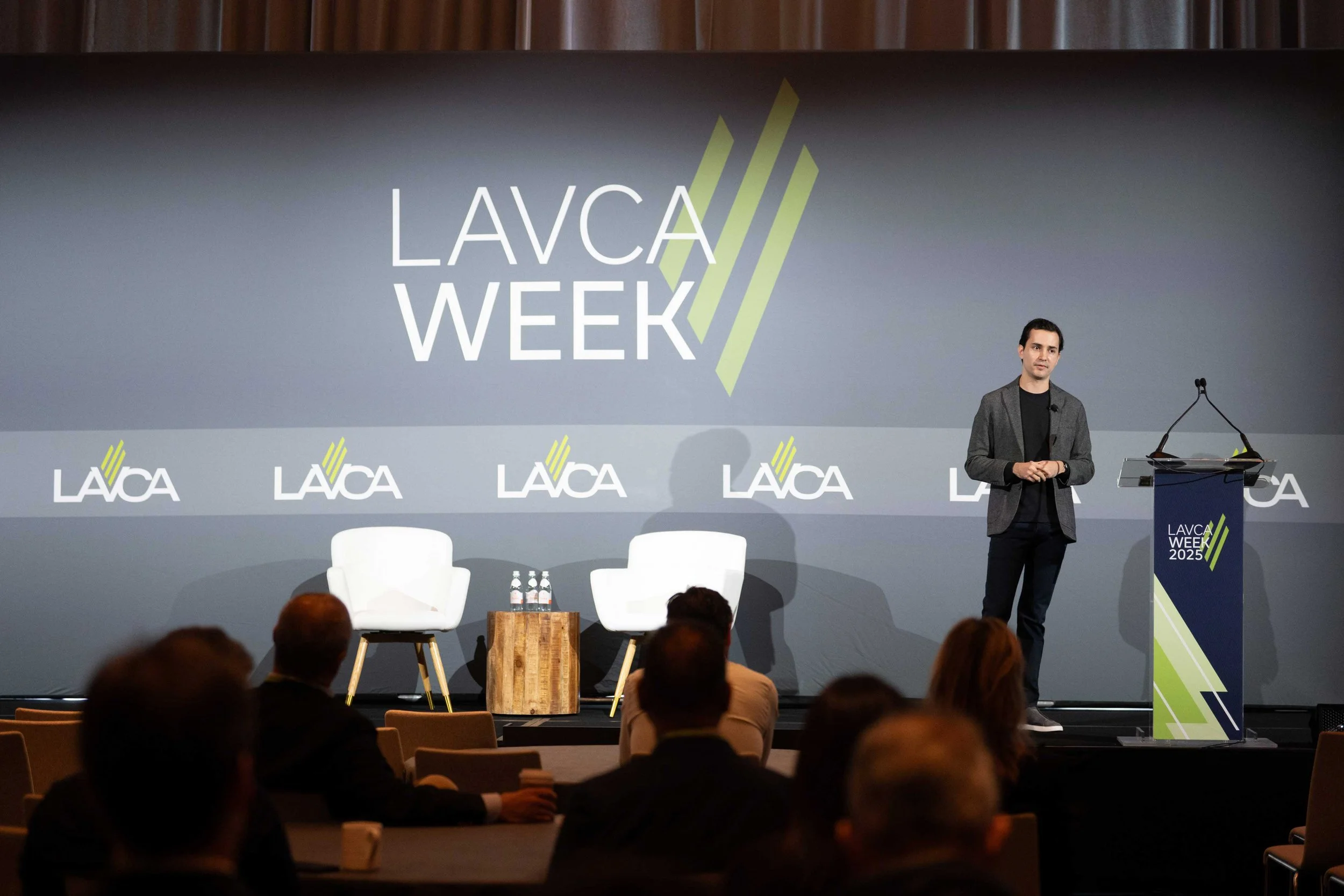
Events
Impact
This redesign replaced a fragmented, high-maintenance website with a cohesive, scalable digital system. By establishing a web-first brand foundation and modular design system, the project reduced design debt, improved internal efficiency, and clarified how the organization shows up across digital and physical channels.
-
Eliminated design debt by replacing legacy plugins and bespoke solutions with a unified, modular system
Increased team velocity through standardized templates and clear visual rules
Established a single source of truth via the organization’s first formal brand guide
Enabled omnichannel scalability with a “designed once, used everywhere” visual system
Reduced operational friction by simplifying backend content patterns for non-design teams
-
Systems-driven restraint creates more long-term flexibility than over-designing
Clear UX and structure can significantly improve cohesion and usability without hard performance metrics
Strong foundations align teams and scale more effectively than one-off design solutions