Set Apart
Integrated Marketing Campaign
Set Apart is a group exhibition presented by Uprise Art, featuring works by Carla Weeks, Hayley Sheldon and Hyun Jung Ahn.
I led the refinement and cross-platform execution of the exhibition’s visual identity, adapting the concept across web, social, editorial, and print while executing the end-to-end marketing plan.
Context
The exhibition needed a campaign that could introduce three artists while maintaining a clear, unified curatorial identity. The challenge was to translate the initial creative concept into a scalable system that worked consistently across digital, social, editorial, and print channels—while preserving the integrity of each artist’s work.
Translate the exhibition concept into a cohesive cross-platform identity
Drive digital awareness and engagement
Support deeper storytelling around each artist
Create assets that scale efficiently across formats
GOALS
I was responsible for adapting and executing the exhibition’s creative concept across all marketing touchpoints.
-
Refined and systemized the exhibition’s visual language
Designed all campaign graphics and layouts
Built the exhibition web page
Curated and designed the Instagram rollout
Created Inside the Studio Journal features for each artist
Designed the print-ready Exhibition Statement
Executed the end-to-end marketing plan
Campaign Overview
1
Visual System Refinement
The initial exhibition concept was translated into a flexible visual system that could scale across channels.
2
Instagram
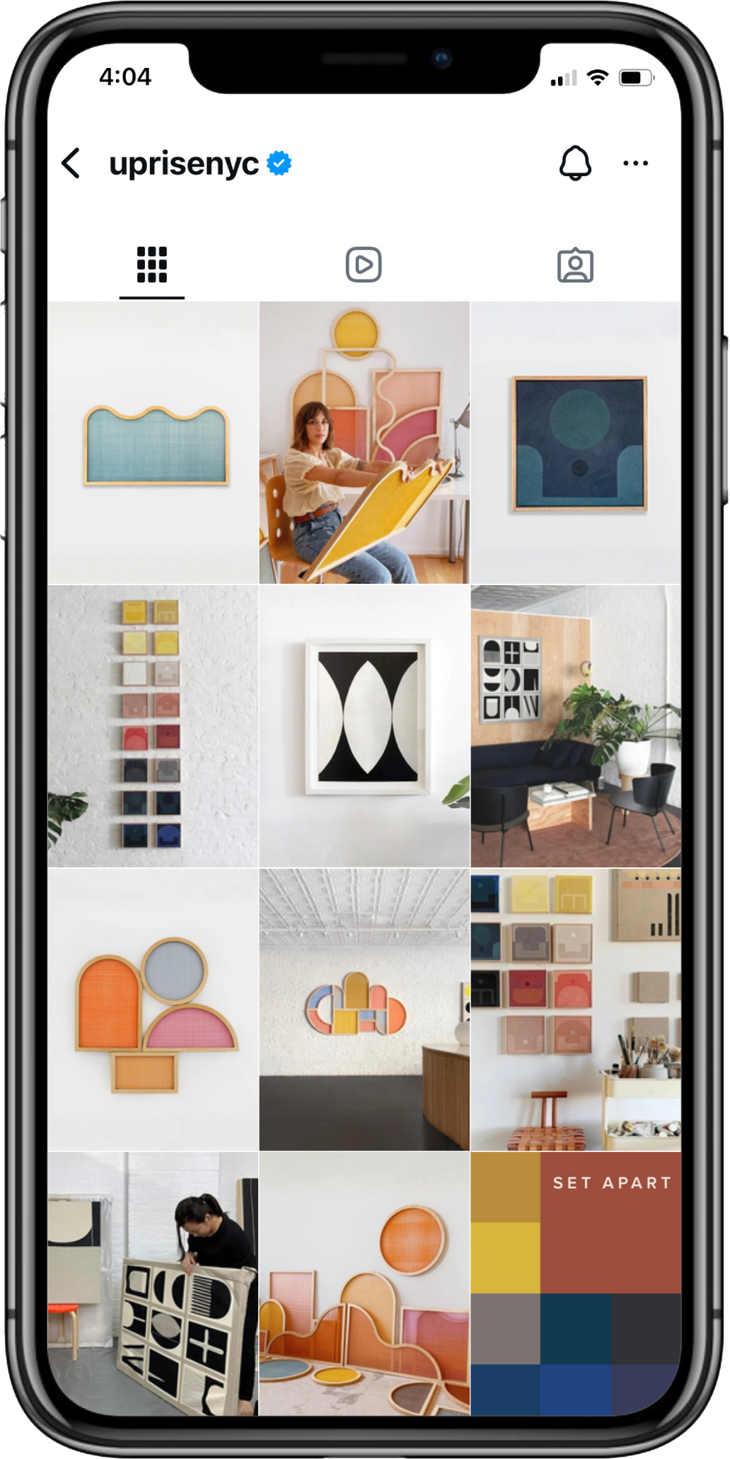
A curated feed and animated GIF established the exhibition’s visual presence and drove discovery.
3
Website
A dedicated exhibition page introduced the show and featured all three artists within a unified layout.
4
Editorial
Individual Inside the Studio Journal entries deepened engagement with each artist’s practice.
5
Print
The Exhibition Statement PDF was adapted directly from digital assets to maintain consistency.
Design System in Practice
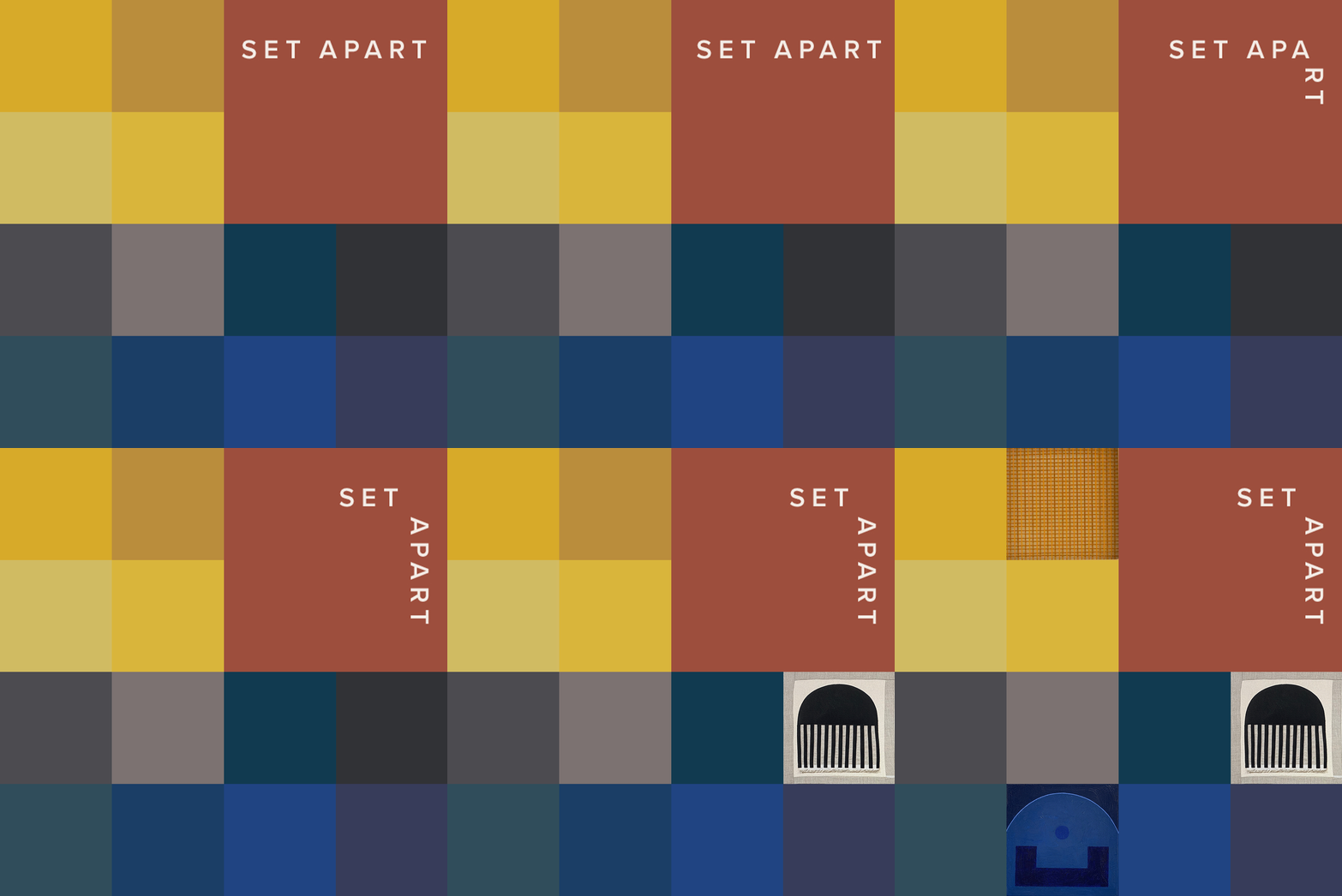
The Instagram GIF was designed early and used as a visual anchor across channels. Establishing clear visual rules—color, shape language, typography, and composition—allowed the campaign to scale efficiently across web, editorial, and print without fragmenting the experience.
Website
Editorial
Outcomes & Takeaways
This project reinforced the value of collaboration and translation—taking a strong creative concept and extending it thoughtfully across platforms to create a cohesive, integrated brand moment.
A cohesive exhibition identity across all touchpoints
Strong visual consistency across digital and print
Extended engagement through editorial storytelling
Efficient execution through reusable assets
OUTCOMES


